Revamp Apps
Kalm
Refresh Kalm design app with new user interface and create a complete design system
Refresh Kalm design app with new user interface and create a complete design system
*This project is an assignment for UI challenge project at Purwadhika Digital School. This case study was done to enhance my learning experience and challenge myself to redesign the existing apps.
Sole UI/UX Designer
Figma, Whimsical
Mobile Apps
1 weeks
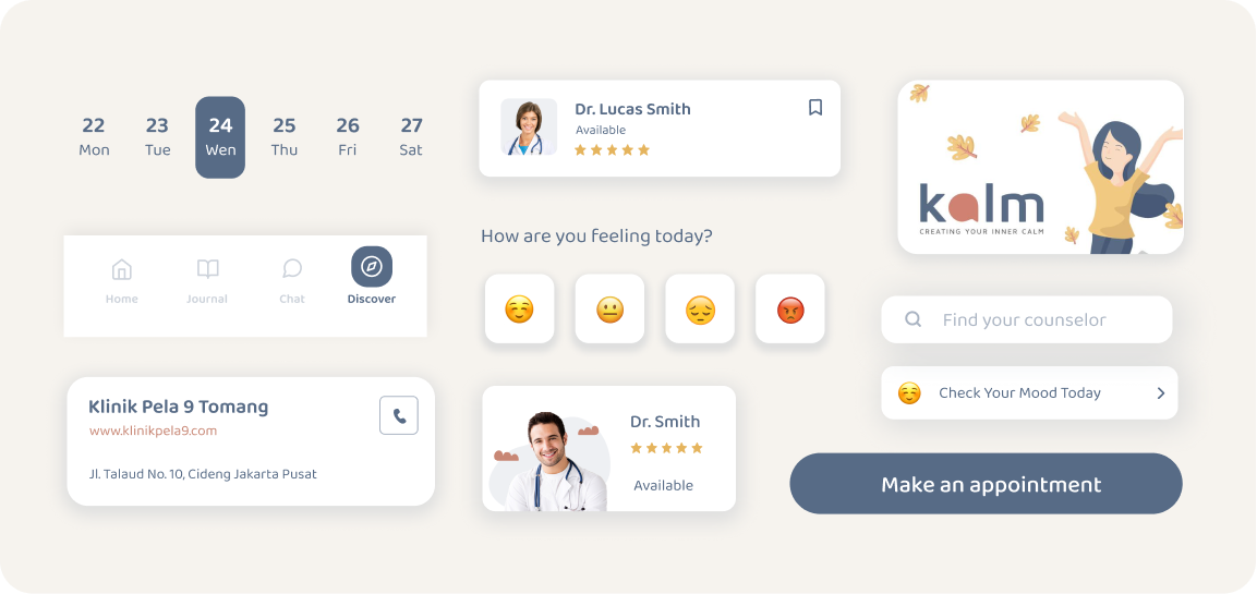
Kalm is an online counseling platform. Kalm provides professional counseling wherever and whenever though smartphones or tablets. The brief of this project is to provide a better Kalm User Experience by improving the User Interface and its flow. Also created a new interface with a complete design system.
Before deciding what app to redesign for this project, I looked at playstore and search for apps that might need a design improvement. And the one I decided to redesign was Kalm. I noticed that the mobile app design was outdated and lacks of flexibility.
I started using the app and analyzing several pain points.
The goal is to improve Kalm’s User Interface and create more consistent visual that match the brand identity. Emphasize the feature of Kalm apps and make their product offerings easy to find.
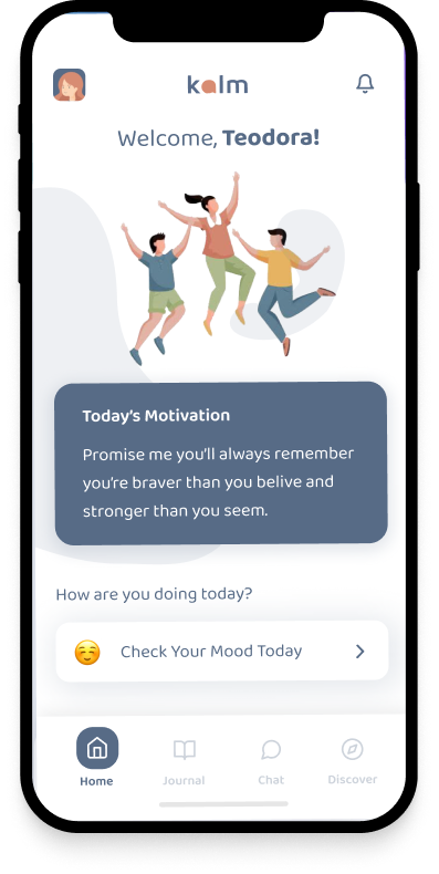
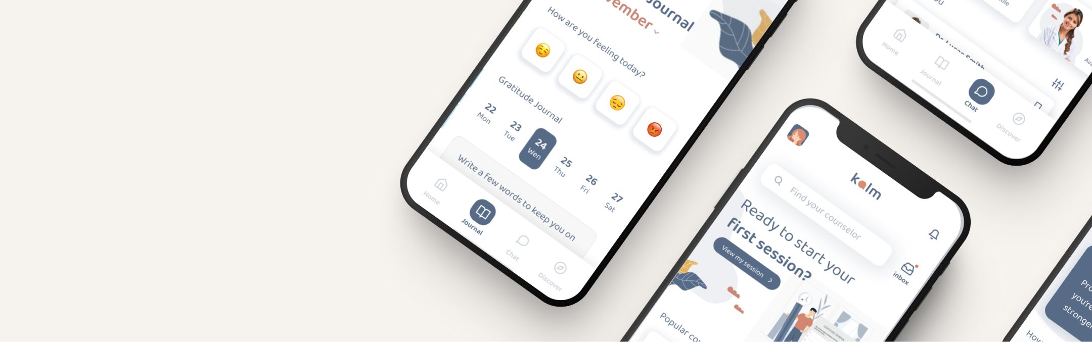
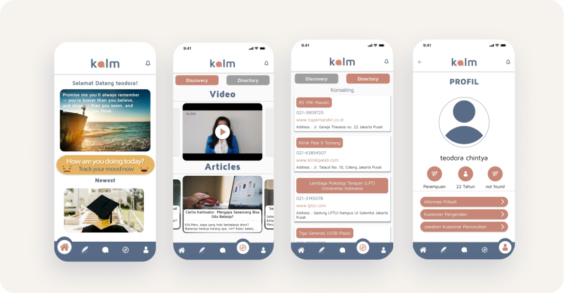
Remove the image on the banner and adjust the text to make it more readable. Adding illustration to generate user emotions. Using organic element to show brand identity. Eliminate and change the moodtracker button to make it clearer.
Rearrange the elements that include some of the information that user needs. Added a date filter to make it easier for user to find specific journal. More white space to create a clean and minimal look.
.png)
.png)
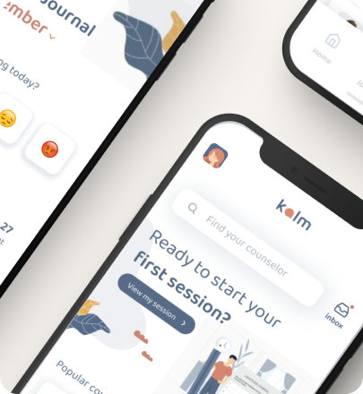
Adding search bar at the top of the page and reorder the visual element. Create an engaging and seamless banner for new users to try out new sessions. Organize and create a section to display counselor options according to user needs.
Reorganize page sections that divide into discovery and directory sections. Create filters and add a search bar for the directory section so users don't have to scroll too much.
.png)
.png)
Put the profile menu on the top left. Add more detailed information about account settings and how to contact customer service or support in account profile.

Lorem ipsum dolor sit amet, consectetur adipiscing elit. Suspendisse varius enim in eros elementum tristique. Duis cursus, mi quis viverra ornare, eros dolor interdum nulla, ut commodo diam libero vitae erat.
Lorem ipsum dolor sit amet, consectetur adipiscing elit. Suspendisse varius enim in eros elementum tristique. Duis cursus, mi quis viverra ornare, eros dolor interdum nulla, ut commodo diam libero vitae erat.
Lorem ipsum dolor sit amet, consectetur adipiscing elit. Suspendisse varius enim in eros elementum tristique. Duis cursus, mi quis viverra ornare, eros dolor interdum nulla, ut commodo diam libero vitae erat.
Lorem ipsum dolor sit amet, consectetur adipiscing elit. Suspendisse varius enim in eros elementum tristique. Duis cursus, mi quis viverra ornare, eros dolor interdum nulla, ut commodo diam libero vitae erat.
Lorem ipsum dolor sit amet, consectetur adipiscing elit. Suspendisse varius enim in eros elementum tristique. Duis cursus, mi quis viverra ornare, eros dolor interdum nulla, ut commodo diam libero vitae erat. Aenean faucibus nibh et justo cursus id rutrum lorem imperdiet. Nunc ut sem vitae risus tristique posuere.
Lorem ipsum dolor sit amet, consectetur adipiscing elit. Suspendisse varius enim in eros elementum tristique. Duis cursus, mi quis viverra ornare, eros dolor interdum nulla, ut commodo diam libero vitae erat. Aenean faucibus nibh et justo cursus id rutrum lorem imperdiet. Nunc ut sem vitae risus tristique posuere.
Lorem ipsum dolor sit amet, consectetur adipiscing elit. Suspendisse varius enim in eros elementum tristique. Duis cursus, mi quis viverra ornare, eros dolor interdum nulla, ut commodo diam libero vitae erat. Aenean faucibus nibh et justo cursus id rutrum lorem imperdiet. Nunc ut sem vitae risus tristique posuere.
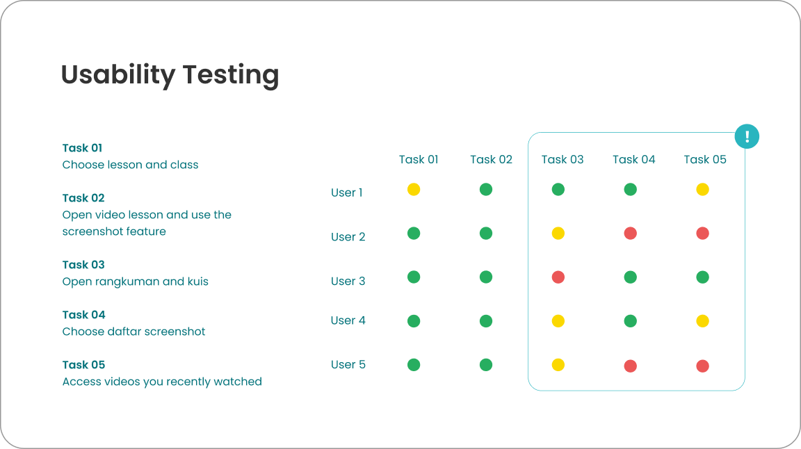
In this research, I focused on understanding user behavior when accessing subject materials in online learning platform and when using Ruangguru app. I do online interviews, usability testing, comparative research and online surveys for data collection. The participant criteria for this research are students who participate in online learning, this including new users and active users of Ruangguru. The total respondent of online surveys was 20 respondents and 5 users for usability testing with online interviews.
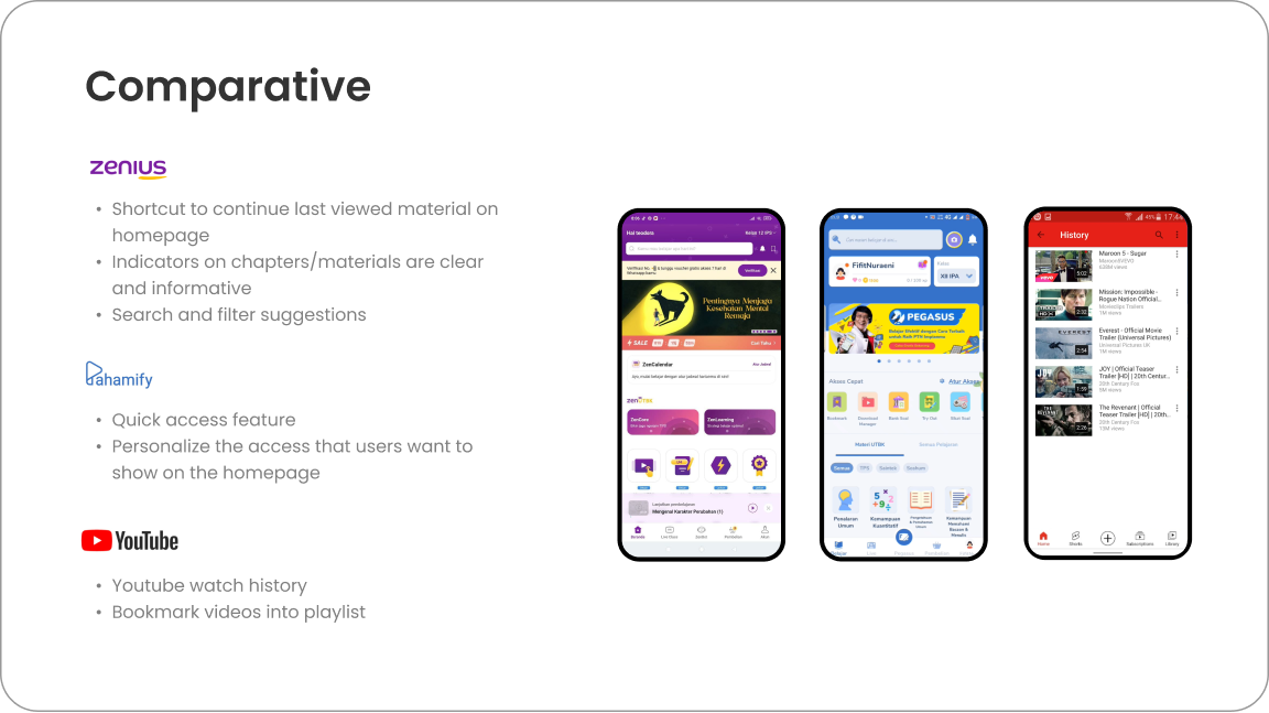
I also do competitive analysis to get more insights about other products. It helps me to get the idea of different features and layout that can be implement for any design improvement.
The next step is to classify insights from users into thematic groupings.
.png)
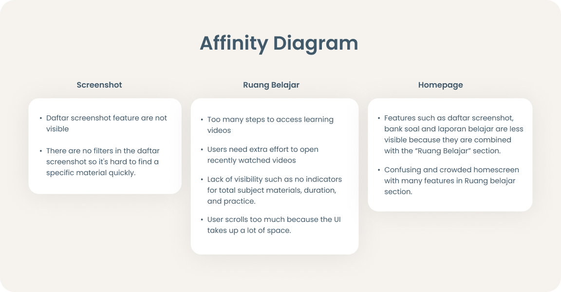
After collecting the data, I’m grouping user’s pain points into Affinity Diagrams to get clearer problems from each category. From those pain points, I selected problems that I wanted to solve. Then, I came up with design improvements and new features solutions.
I recorded interviews and got insights and problems that user faced while using app. then i compiled it and summed it up using affinity diagram to see which problems came up frequently.

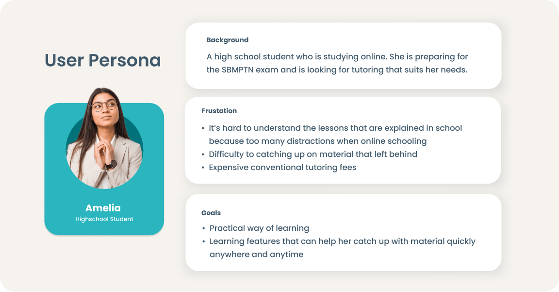
I created user persona based on the interview results. This persona will contain the details of the user's goals, background, and frustrations.
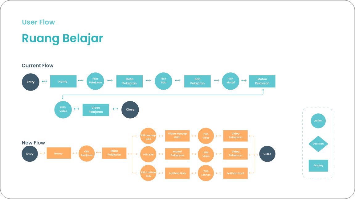
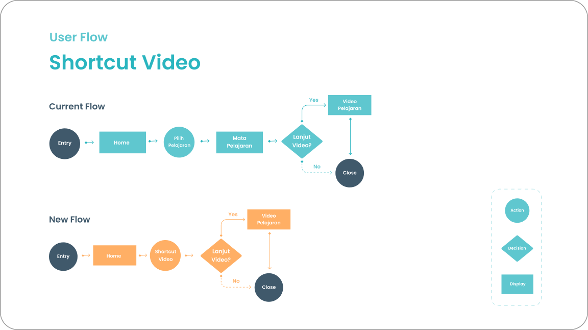
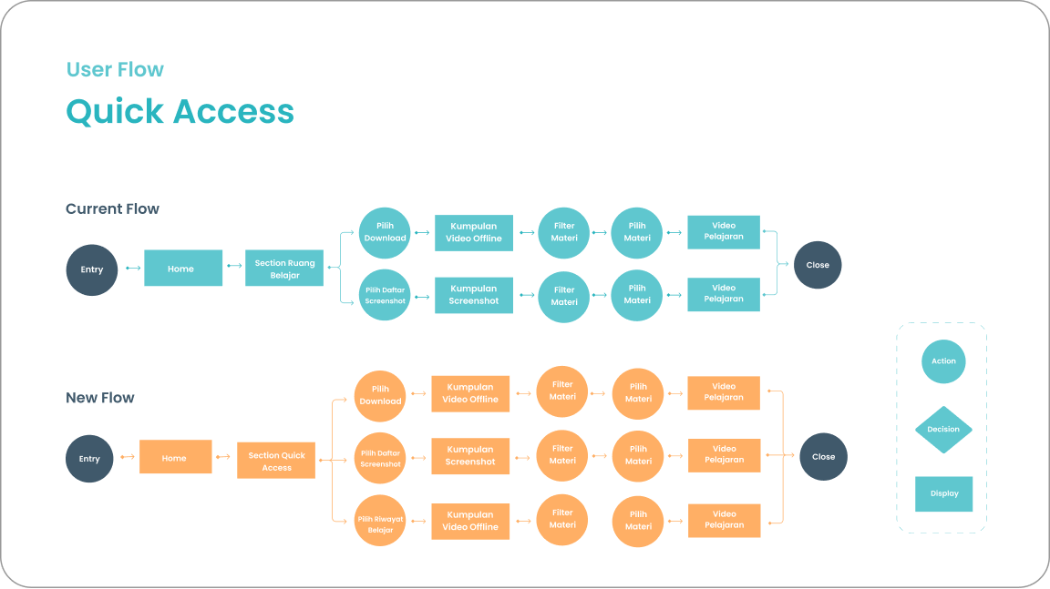
In this stage, I define the user’s journey when accessing learning materials and exploring Ruang Belajar features. I added the current flow and new flow of Ruang Belajar for comparison.
I spent several hours sketching loose boxes which will later turn into a more refined design. Once I'm done with the sketch, I had a basic idea of what the final screens will look like and give it more clarity by digitalizing the wireframes.
After analyzing the style and typography that the app is currently using, I chose a similar font and color that represents Ruangguru.
.png)
After prototyping, I did usability testing to get feedback from users. Then, I’m doing iteration to finalize the design.
.png)
.png)
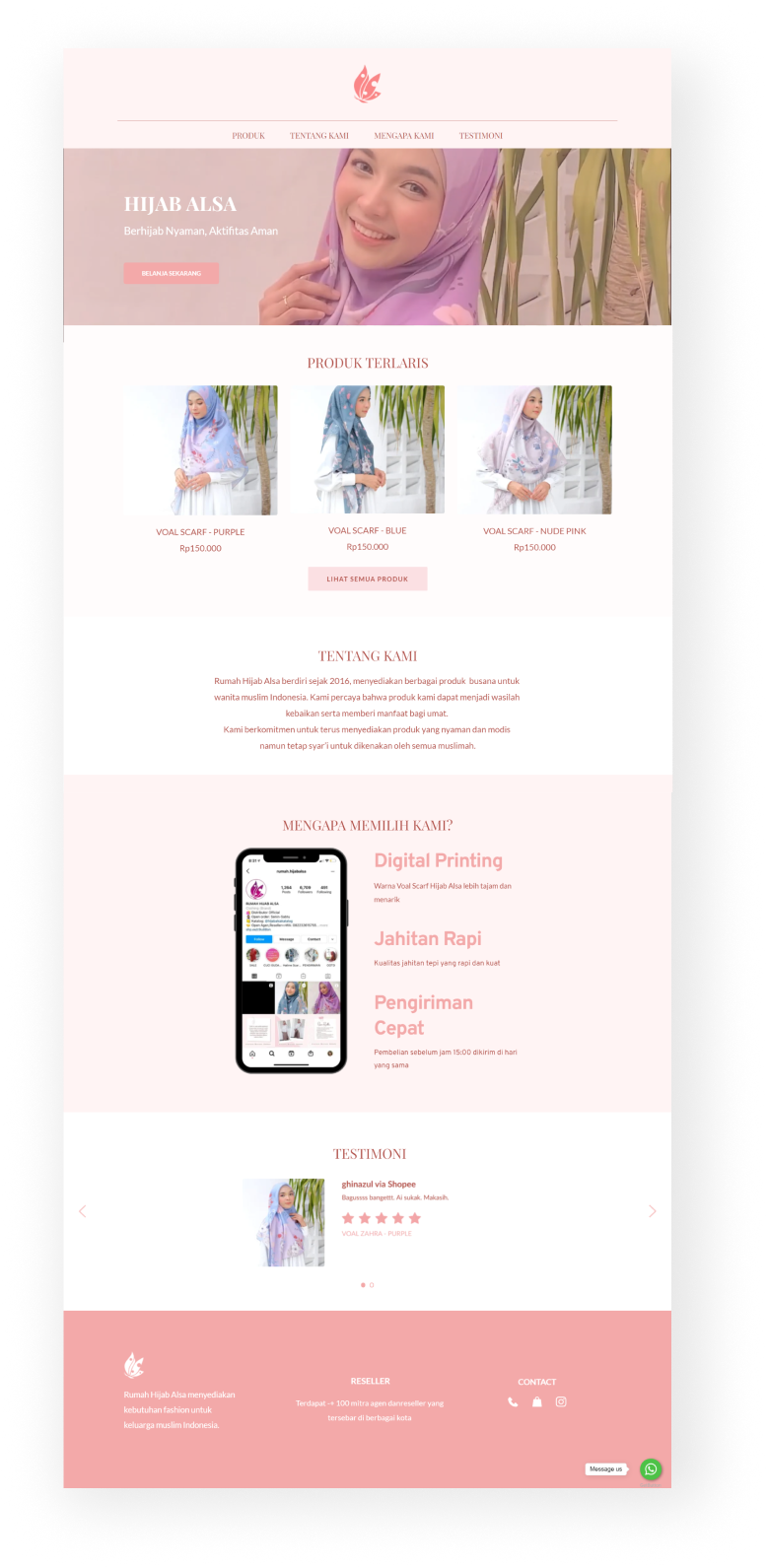
We did 2 sessions of interviews with the founder to get a better understanding about the brand direction. Starting with understanding the brand, we ran a discovery discussion to find the possible solutions.
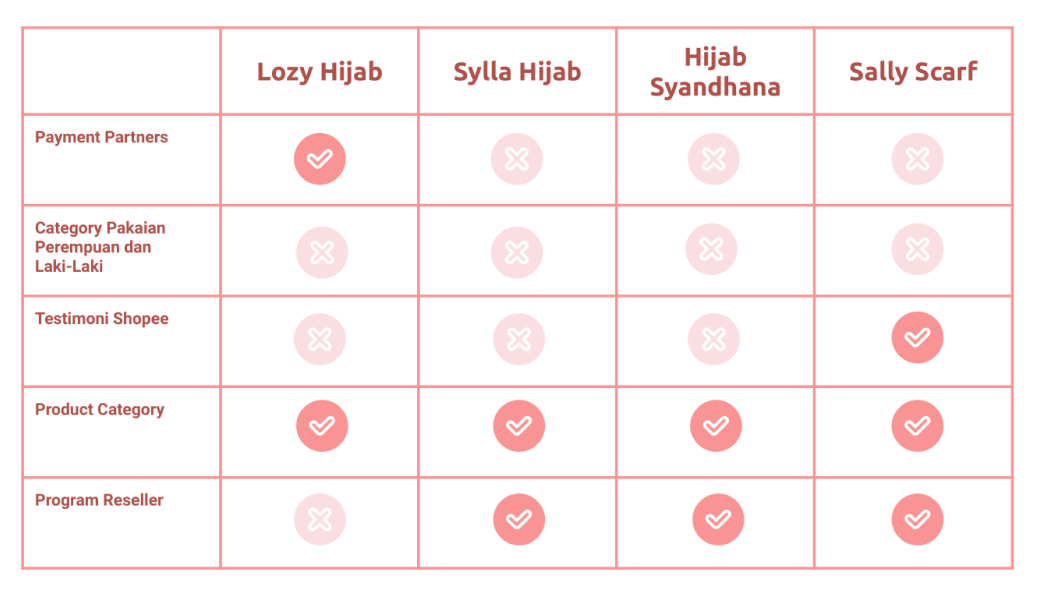
The next step is looking at the direct competitors of Hijab Alsa. I did research to compare 4 websites that provide similar products & services. I tried to compare the overall user experience and the features provided.
We wanted to highlight the best-selling products in the heroes section with a clear CTA that can be integrated directly into marketplace. Testimonials are also included to convince the users. We'd also want to include some information about brand stories and other platforms that users can reach.
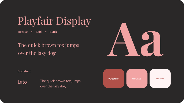
After gaining more information about the brand and the competitors, we decided to build style guideline. We choose colors that represent Hijab Alsa, and pick the color from the brand logo with a touch of red to give contrast. For heading text, we use serif fonts to give it a premium and feminine feel.
We use figma to create style guidelines and organize the hi-fi design with collaborative process. We agreed that the page structure should contain navigation menu, hero section products section, about the brand, value proposition statement, testimonials and footers. We also consider the limitations that we can implement when designing in page builder.
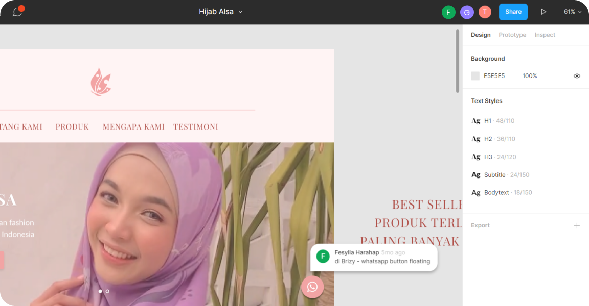
In this step, the UI Designer implements the final design into brizzy page builder and launch the website. We also make sure that all information is included, well-designed and responsive.
To start with, I went through a lot of inspiration that related to this app. When it comes to visuals, I try to provide a minimal and clean look that will enhance usability. The visual design focus on heart-warming, and calm through employment of soft colors (the brand colors), organic shape, and clean design element.
.png)
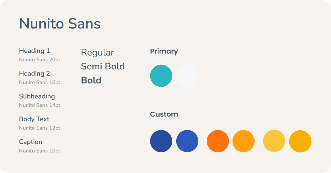
First I observing the design system of the current app from typeface, color, and other visual element they currently use. Then, I compile it into style guideline that I would use in the design process.
.png)
I gain some inspiration around design pattern like UI element, UI Illustration, font size and spacing. Then I designed the existing components to be more consistent and sustainable design system.
.png)

.png)
.png)
.svg)
